




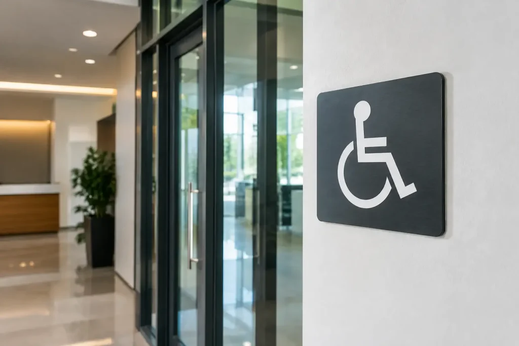
A restroom sign mounted beautifully in the wrong location can still create a real access problem. The same is true of a directory with tiny type, an inaccessible entrance with no directional sign, or a parking space missing the proper identification. ADA signs for commercial buildings are not a decorative afterthought. They are part of how customers, tenants, visitors, and employees move through your property safely and independently.
For business owners and property managers, the goal is not to cover every wall with plaques. It is to build a clear, durable sign system that supports the building’s layout, reflects the brand, and meets applicable accessibility and local code requirements. That takes more than ordering standard signs online. It takes a plan that accounts for what each sign needs to communicate, where it will be installed, and how the property will change over time.
Which Commercial Signs Need ADA Features?
Not every sign in a commercial property follows the same ADA rules. The requirements depend on the sign’s purpose. A sign identifying a permanent room or space, such as a restroom, conference room, exit stair, electrical room, or tenant suite, will generally require tactile characters and Braille. These signs help a person who is blind or has low vision identify the space after arriving at the door or entrance.
Directional and informational signs are handled differently. A lobby directory, directional arrow, parking instruction, or building map may not require tactile lettering, but it still needs to be readable. Contrast, finish, size, placement, lighting, and viewing distance all affect whether a sign works in practice.
This distinction matters because a one-size-fits-all approach can create unnecessary expense in some areas and compliance gaps in others. A property may need tactile restroom identification, for example, while its larger wayfinding system needs strong visual hierarchy and clear routing instead of Braille on every panel.
Permanent room identification
Tactile signs typically use raised characters and Grade 2 Braille. The lettering must meet specific standards for character style, size, case, spacing, and contrast. Raised characters are commonly uppercase and must be easy to read by touch. Braille is placed below the corresponding text.
These details are not optional finishing touches. A thin script font, tightly packed lettering, or shallow engraving may look polished from a distance but fail to provide usable tactile information. Material choice also matters. A sign that chips, warps, or fades after a season of cleaning and weather exposure can stop performing as intended.
Directional and informational signs
Wayfinding signs guide people to accessible entrances, elevators, restrooms, guest services, tenant spaces, and other destinations. They should be designed around real decision points: where a visitor enters, where hallways split, where an elevator opens, or where a route changes.
Good directional signage answers the question a visitor has at that exact moment. It does not make someone walk down a hallway to find out they chose the wrong path. Clear arrows, readable type, adequate color contrast, and consistent terminology do most of the work.
Placement Is Where Many ADA Sign Problems Begin
A compliant sign can become noncompliant when it is installed in the wrong spot. For tactile room-identification signs, placement beside the door is usually required so a person can find the sign without standing in a door’s swing path. Mounting height also matters. ADA standards generally call for the baseline of the lowest tactile character to be at least 48 inches above the finished floor and the baseline of the highest tactile character to be no more than 60 inches above the finished floor.
The latch side of the door is usually the correct location. However, double doors, doors with no latch, and doors with limited wall space can require a different placement approach. Obstructions such as drinking fountains, furniture, decorative panels, or protruding displays can also interfere with access to the sign.
This is why field verification is worth the time. A drawing may show enough wall area, but actual conditions can include trim, electrical panels, door hardware, sprinkler controls, or a door swing that changes the installation plan. Measuring before fabrication helps prevent costly remakes and last-minute patchwork.
Parking, Entrances, and Accessible Routes Need Clear Direction
Accessible parking signs are one of the most visible parts of an ADA sign package, and they are often overlooked until an inspection or customer complaint. Designated accessible spaces need the appropriate International Symbol of Accessibility sign. Van-accessible spaces require additional identification, and sign height and visibility must be maintained above parked vehicles.
The route from parking to the building deserves equal attention. If the accessible entrance is not the main entrance, visitors need clear directional signs at the public entrance and along the route. A sign that simply says “Accessible Entrance” is not always enough. Depending on the site, it may need an arrow or other information that makes the route understandable before a visitor commits to a path.
Older shopping centers, medical offices, restaurants, and multi-tenant properties often have the most complicated conditions. Grade changes, side entrances, shared lots, and remodels can make the accessible route less obvious than the original site plan suggests. In these settings, signage is a practical part of customer service, not just a code item.
Build ADA Requirements Into the Design, Not After Installation
The best time to address accessibility signage is during planning, whether you are opening a new location, remodeling an office, refreshing a retail space, or rebranding a multi-tenant building. Waiting until construction is nearly complete can limit placement options and force compromises in materials or design.
Start by walking the property as a first-time visitor would. Enter from the parking lot. Find the main lobby, restrooms, elevator, suite, checkout area, and exits. Notice where someone could hesitate or take a wrong turn. That walk-through often identifies signage needs that a floor plan alone will miss.
Next, separate signs by function. Permanent room signs, wayfinding signs, parking signs, code-required exit signage, tenant directories, and branded environmental graphics each have different performance needs. Grouping them early makes budgeting and production more predictable.
A full-service sign partner can coordinate design, fabrication, permitting, installation, and any electrical work needed for illuminated or exterior elements. For a property owner, that reduces the handoffs between a designer, sign fabricator, electrician, installer, and general contractor. Rudnick Enterprises takes that coordinated approach so the visual details and site conditions are handled together.
Balance Compliance With Brand and Durability
ADA requirements do not mean every sign must look institutional. Color, substrate, mounting hardware, panel shape, and overall visual system can still support a hotel, restaurant, office, healthcare facility, or retail brand. The key is to protect the required tactile and visual elements while giving the system a consistent, professional appearance.
Contrast is a good example. A sign can use brand colors, but the characters must stand out clearly from the background. Glossy surfaces can also create glare under lobby lighting or sunlight, so a matte or low-glare finish is often a better choice for readable interior signs.
Durability is another practical decision. Exterior parking and entrance signs need materials and hardware that can stand up to weather, mowing equipment, vehicle contact, and repeated cleaning. Interior signs may need to resist disinfectants, fingerprints, and frequent tenant turnover. A less expensive material can be appropriate for temporary use, but it may not be the right value for a permanent, high-traffic location.
Do Not Confuse ADA Signage With Every Code Requirement
ADA standards are only one part of the picture. Local building codes, fire codes, zoning rules, landlord requirements, and permit conditions may affect sign placement, emergency egress markings, occupant-load signs, electrical components, and exterior signage. Requirements can also vary based on whether the work is new construction, an alteration, or maintenance at an existing building.
Exit signs and emergency lighting, for example, involve life-safety requirements that go beyond tactile room identification. A tenant build-out may also trigger a broader review of accessible routes, door clearances, parking, and restroom conditions. Signage should be evaluated as part of the project, not isolated from it.
For Louisville, Southern Indiana, and surrounding commercial properties, early coordination helps keep permit questions and installation conflicts from delaying an opening. A site-specific review is the sensible path because building layouts, jurisdictions, and existing conditions are rarely identical.
Keep the Sign System Current After Move-In
Compliance can slip when a building changes. A suite is repurposed, a restroom designation changes, a tenant moves, furniture blocks a sign, or a parking lot is restriped without replacing its identification signs. Regular property walks help catch these issues before they become a visitor frustration or an inspection concern.
When you add, replace, or relocate signage, match the established system rather than creating a collection of unrelated plaques. Consistent names, arrows, colors, and mounting locations make the building easier to use for everyone.
The right ADA sign package does more than satisfy a requirement. It shows people where to go, removes uncertainty at the door, and helps your commercial property feel prepared, professional, and welcoming from the first visit.