



A visitor has made it to the right office complex, parked in the correct lot, and walked through the main entrance. Then they stop. Which elevator serves Suite 400? Is the accounting firm down this hallway or through the glass doors? Where should a delivery driver go? Wayfinding signage for office buildings answers those questions before frustration has a chance to shape a visitor’s impression of the property.
For property managers, building owners, and developers, this is more than a convenience item. Clear directional signage supports tenant satisfaction, makes common areas feel professionally managed, and helps an office building operate as intended. The best systems are planned around the way people actually move through a property, not just around a list of rooms that need labels.
What Wayfinding Signage Does for an Office Building
Wayfinding is the system of signs, visual cues, and location information that helps people understand where they are, where they need to go, and how to get there. In an office setting, that system often begins before someone enters the building. Monument signs, parking identifiers, and entrance signs establish the first layer of direction. Inside, directories, suite signs, floor plaques, room markers, and directional signs continue the path.
A well-designed system reduces repeated questions at the front desk and limits the need for tenants to create makeshift paper notices for visitors. It can also help prospective tenants see a multi-tenant property as organized, established, and easier to do business from.
There is a practical safety benefit as well. Clearly identified exits, stairs, elevators, restrooms, and accessible routes help occupants move confidently through the building. Certain signs may be required by building codes, fire codes, accessibility standards, or local regulations. Those requirements should be considered early, especially during renovations or tenant build-outs, rather than treated as a final detail.
Start With the Visitor Journey, Not the Sign List
A common mistake is ordering signs one at a time as needs arise. That approach can solve an immediate problem, but it often leaves a building with mismatched materials, inconsistent names, and directions that are hard to follow. A better starting point is to walk the property from the perspective of several different users.
Consider the first-time visitor who parks outside, the delivery driver carrying boxes, the employee arriving through a side entrance, and the person with limited mobility who needs an accessible route. Their paths may overlap, but they do not always need the same information. A visitor may need a lobby directory and suite direction. A delivery driver may need a clearly marked loading area. An employee may need stair and parking guidance that the public never sees.
During this review, identify every decision point. These are the places where people pause, turn, or become unsure of their next step. Typical decision points include parking lot entrances, exterior doors, lobby intersections, elevator banks, stairwells, hallway branches, and floor transitions. If a sign is installed after the point where a person needed to make a decision, it is too late to be useful.
Build a Clear Information Hierarchy
Not every sign should try to communicate everything. A strong wayfinding system gives people the right amount of information at the right time.
At the exterior level, focus on property identification, tenant visibility where appropriate, parking, entrances, and deliveries. At the lobby level, a directory should help visitors confirm they have arrived at the correct building and locate the right floor or suite. On upper floors, signs should narrow the information further with suite ranges, tenant names, directional arrows, and room identification.
This hierarchy prevents clutter. A lobby directory filled with every conference room, utility closet, and staff-only space is difficult to scan. Conversely, a hallway sign that only says “Suites” does not give a visitor enough direction. The information should become more specific as the visitor gets closer to the destination.
Choose Sign Types That Match the Building’s Needs
Office properties vary widely. A small professional building with four suites needs a different solution than a medical office campus, corporate headquarters, or multi-story property with dozens of tenants. The right sign types depend on building size, tenant turnover, traffic patterns, and the character of the space.
Directories are often the backbone of multi-tenant office wayfinding. They can be wall-mounted, freestanding, illuminated, or digital, depending on the location and how frequently tenant listings change. Changeable directories may cost more initially, but they can reduce replacement work in properties with regular tenant turnover. Permanent dimensional lettering may be a better fit for an owner-occupied headquarters or a stable tenant roster.
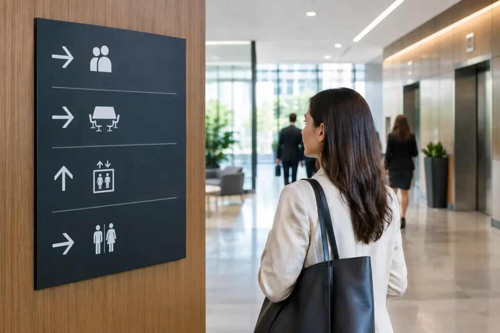
Directional signs should be placed where choices occur and should use plain language. “Elevators,” “Restrooms,” “Suites 200-240,” and “Reception” are faster to understand than vague labels or clever wording. Arrows should be consistent throughout the property. If a right-pointing arrow means one thing on the first floor and something different in the parking garage, visitors will notice.
Suite identification signs, room signs, and ADA-compliant tactile signs handle the close-up portion of the journey. These signs need to be readable at a short distance and positioned consistently. In many cases, accessibility requirements affect mounting height, contrast, tactile characters, Braille, and placement near doorways. The exact requirements depend on the application and local enforcement, which is why early planning is helpful.
Make the System Feel Like Part of the Property
Functional signs do not have to look generic. Wayfinding should support the building’s architecture and tenant brand environment without becoming difficult to read. Material choices such as acrylic, metal, dimensional letters, vinyl graphics, and illuminated components can all serve a purpose when selected for the right location.
For example, a polished professional office may use brushed metal plaques with restrained accent colors. A modern creative workspace may use bolder color blocking and wall graphics to distinguish floors or departments. A medical office building may prioritize high contrast, large type, and calm visual cues for patients who are under stress or unfamiliar with the facility.
Consistency matters more than decoration. Use the same typefaces, arrow styles, color rules, and sign mounting approach across the system. If each floor looks unrelated to the next, visitors have to relearn the building as they move through it. A unified system makes a property feel intentional and easier to navigate.
There is a trade-off between matching a tenant’s individual brand and preserving a cohesive building identity. In a multi-tenant office property, it usually makes sense for the core wayfinding signs to follow the property standard, while tenant names and approved logos appear within designated areas. This keeps the directory readable and makes updates simpler when occupancy changes.
Plan for Visibility, Lighting, and Maintenance
A sign can have excellent graphics and still fail if people cannot see it. Lighting conditions change throughout the day, particularly in lobbies with large windows, parking areas, and exterior walkways. Contrast, letter size, viewing distance, glare, and illumination all affect whether a sign performs as intended.
Exterior directional signs need durable materials and finishes that hold up to weather, sun exposure, and routine cleaning. Interior signs face different challenges, including wall damage, changing tenant names, and cleaning products that can affect certain surfaces. Choosing materials based on location helps avoid premature replacement.
Maintenance should be part of the original plan. Burned-out illumination, peeling graphics, missing directory inserts, and outdated suite names tell visitors that a building is not being actively managed. A routine review of signs after tenant changes, remodels, and seasonal lighting shifts can prevent small issues from becoming visible problems.
Coordinate Signage With Electrical and Construction Work
Some projects are straightforward: replace a directory, add suite plaques, or update hallway signs. Others involve new illuminated signs, digital directories, wall modifications, dedicated electrical circuits, structural considerations, permits, or coordination with a remodel schedule.
This is where a single experienced team can reduce unnecessary back-and-forth. When signage, electrical work, permitting, fabrication, and installation are coordinated together, the plan is less likely to miss a power requirement, mounting condition, or code detail. Rudnick Enterprises works with commercial property owners and managers throughout Louisville and Southern Indiana to handle those moving parts from consultation through installation and service.
Before fabrication begins, confirm tenant names, suite numbers, final floor plans, approved brand standards, and responsibility for future updates. It is much easier to correct a spreadsheet or proof before production than to revise installed signs later. For larger properties, a sign location plan can help everyone review the system in context rather than approving individual pieces in isolation.
A Good System Keeps Working After Opening Day
The strongest office wayfinding system is almost unnoticed because it makes movement feel easy. Visitors arrive at the correct entrance, understand where to go, find the right suite, and leave with the sense that the building is well cared for. Tenants benefit from fewer interruptions and a more professional experience for their clients.
Whether an office building needs a complete directional package or a focused update to solve recurring confusion, the goal is the same: give people clear answers before they have to ask. When signs are planned carefully, built for the space, and maintained over time, they become one of the most practical improvements a commercial property can make.