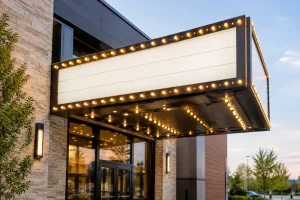





A visitor pulls into a busy medical office park, retail center, or apartment community with one question: where do I go? If the answer is not obvious within a few seconds, they may circle the property, park in the wrong place, call the office frustrated, or leave altogether. Effective wayfinding & map design turns that uncertain moment into a clear path from the street to the right door.
For property owners and business operators, wayfinding is more than a sign package. It is a practical system for helping people make decisions at every point of the visit. It can improve customer experience, support tenant visibility, reduce staff interruptions, and make a property feel organized and professionally managed.
What Wayfinding & Map Design Really Does
Wayfinding includes the signs, maps, building identifiers, directional markers, parking guidance, and visual cues that help people understand where they are and where they need to go. A map is one part of that system, but it cannot do all the work by itself.
Think about a multi-tenant commercial property. A driver first needs to identify the correct entrance from the road. Once on-site, they need to know which drive lane leads to the right building or suite. At the building, they may need confirmation that they have arrived at the correct entrance. Inside, they may need direction to a reception desk, elevator, restroom, office, or service counter.
Each sign should answer a specific question. Good wayfinding does not make visitors stop and study. It provides the right information just before it is needed.
This is especially valuable for healthcare offices, schools, hospitality properties, large retailers, warehouses, industrial facilities, apartment communities, and office parks. The larger or more complex the site, the more costly confusion becomes. But even a small business can benefit from a clear entry sign, parking direction, and readable interior identification.
Start With the Visitor’s Actual Route
The best designs begin with a site walk, not a guess from a floor plan. A sign that looks clear on paper may be blocked by landscaping, hidden by parked vehicles, difficult to read at driving speed, or positioned after the point where a driver needed to make a turn.
Walk the property as a first-time visitor would. Begin at the nearest major road, then enter from each driveway. Follow the route to parking areas, building entrances, tenant spaces, and key interior destinations. Notice where people hesitate. Those are decision points, and decision points are where clear wayfinding earns its value.
A practical review should consider sightlines, vehicle speed, pedestrian paths, lighting conditions, accessible routes, existing signs, and likely points of congestion. For a property manager, it is also worth considering recurring questions received by leasing, front-desk, or maintenance teams. If visitors routinely ask where to park, which entrance to use, or how to find a suite, the current system is telling you where it falls short.
The goal is not to place a sign at every corner. Too many messages can be as confusing as too few. The goal is to create a logical sequence of reassurance: you are entering the right property, you are headed in the right direction, and you have arrived.
Design for Drivers and Pedestrians Differently
A driver moving through a parking lot needs short messages, large type, and a clear directional arrow. A pedestrian standing at a building directory can take in more detail. Trying to make one sign serve both audiences usually creates a compromise that serves neither well.
Vehicle-oriented signs should focus on the next action: Building B, visitor parking, receiving entrance, leasing office, or exit. Pedestrian signs can include suite ranges, department names, amenities, and map detail. Separating these needs makes the entire property easier to use.
Make Maps Useful at a Glance
A property map should orient people quickly, not force them to decode an architectural drawing. The map needs a clear “You Are Here” marker, an obvious property entrance, recognizable building shapes, labeled destinations, and a simple path or directional relationship between locations.
Orientation matters. If a person is facing north when they look at the map, a north-up map may feel natural. In other locations, it may be more useful to orient the map to match the viewer’s physical viewpoint. There is no single right answer. It depends on how the sign is positioned and how visitors approach it.
Keep labels practical. Use the name guests see on the door, in appointment reminders, or in tenant communications. A building code or suite number may be necessary, but it should not replace familiar destination names when those names are what people are looking for.
Color can help organize information, particularly on larger campuses or multi-building sites. For example, each building zone may use a distinct color, while shared destinations such as restrooms, elevators, or leasing offices use consistent symbols. Color should support the message, not carry it alone. People with color-vision differences, visitors in poor lighting, and anyone viewing a weathered sign still need to understand the information through text, contrast, and layout.
Build a Consistent Sign Family
Wayfinding works best when signs look like they belong together. Consistent typography, colors, arrows, icons, mounting styles, and message hierarchy tell visitors they are following one organized system.
That consistency should still leave room for a property’s brand. A polished retail development may use materials and colors that reinforce its identity. A medical campus may prioritize calm, high-contrast readability. A warehouse may need durable, highly visible signs that support truck traffic and safety requirements. The right approach depends on the property, its users, and the environment.
Readability should always take priority over decoration. Fancy typefaces, low-contrast colors, crowded layouts, and long destination names can make a sign harder to use. At a distance, the clearest sign is usually the one with fewer words and stronger visual separation.
For multi-tenant properties, plan for change from the beginning. Tenant panels, directory inserts, replaceable graphics, and modular sign components can make updates more manageable when businesses move in, expand, or relocate. A lower initial cost is not always a savings if every tenant change requires rebuilding an entire sign.
Account for Code, Access, and Installation Conditions
Wayfinding signs are part of the built environment, so they need to work with more than the design concept. Local sign regulations, landlord requirements, permitting, accessibility standards, electrical needs, and structural conditions can all affect the final solution.
For example, an exterior monument directory may require review for placement, height, setbacks, foundation work, and illumination. Interior signs may need tactile characters or braille where required. An illuminated directional sign may require electrical planning and safe access for future service. These details are easier and less expensive to address early than after production is underway.
Material selection matters, too. Exterior maps and directional signs face sun, rain, temperature changes, lawn equipment, vehicle traffic, and cleaning. A finish that looks sharp on installation day should also hold up through years of use. Indoors, durability still matters, especially in high-traffic corridors, healthcare facilities, schools, and public-facing offices.
A full-service signage partner can coordinate design, engineering, permitting, fabrication, installation, and electrical requirements as one connected project. That reduces the chance that a well-designed sign system becomes delayed by an overlooked site condition or code requirement.
Know When to Update an Existing System
A complete replacement is not always necessary. Sometimes a property needs better directional signs at two confusing intersections, a refreshed map, updated tenant panels, or clearer building numbers. Other times, patching an outdated system only extends the problem.
Consider an update when visitors frequently ask for directions, new construction has changed traffic patterns, tenant turnover has made directories cluttered, signs are faded or damaged, or a rebrand has made the property look inconsistent. A renovation, parking-lot reconfiguration, or accessibility upgrade is also a good time to review how people move through the site.
The strongest systems are maintained as the property changes. A missing arrow, outdated tenant name, or unlit building identifier can interrupt the entire visitor journey. Routine inspections and timely repairs protect both usability and appearance.
Clear direction is a form of customer service before anyone reaches the front desk. When your signs and maps reflect how people actually arrive, park, walk, and search, your property feels easier to trust. Start by looking at the route through your site with fresh eyes, then make each next step simple enough that no one has to ask.